Why Katalog?
Implementing UIs in the mobile app is becoming complex, and we need to be aware of visual omissions and degradation. Katalog is the UI catalog library that can manage, organize, and preview UI components inspired by Storybook and Playbook.
Katalog is enabled to build UIs independently from the domain/logic and it can easily play any UI state even hard-to-reach cases and edge cases. Also, it is useful for facilitating UI components reuse by managing and previewing UIs.
Katalog will be a powerful driver of your development.
Features of Katalog
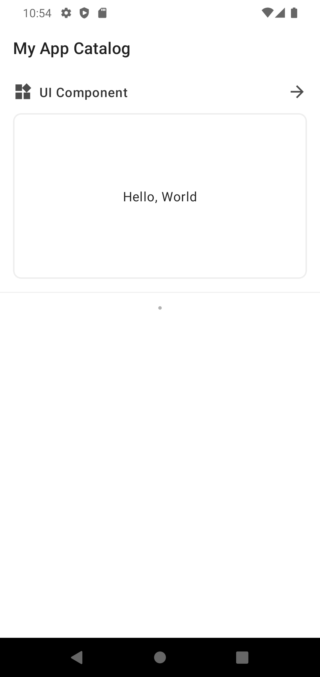
It is made with Jetpack Compose and you can preview Composable.
You can easily register and group UI components using the DSL , as shown below.
class MyApplication : Application() {
    override fun onCreate() {
        super.onCreate()

        registerKatalog(
            title = "My App Catalog"
        ) {
            compose("UI Component") {
                Text(text = "Hello, World")
            }
        }
    }
}
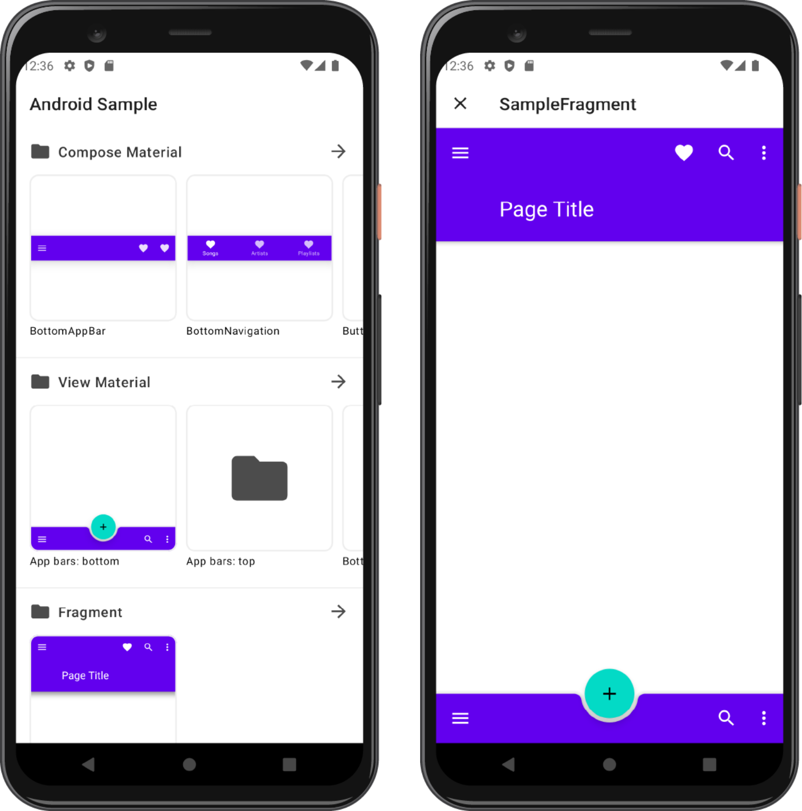
In addition to Composable, the following UI components are supported
- Android View
- DataBinding / ViewBinding
- Fragment
view(
    name = "TextView"
) {
    TextView(context).apply {
        text = "Hello, World"
    }
}
binding(
    factory = SampleBinding::inflate,
    name = "Binding Sample"
)
fragment {
    SampleFragment()
}
Extensions
Katalog provides additional features as Extensions. Currently, the following extensions are available.
- Compose Theme (Change the Compose Theme)
- Android Theme (Change the Android Theme)
- Page Saver (Restore the previously opened page)
You can create an Extension. Please refer to this document for more information.
Sample App
Check out the sample app here.
Ideas
We consider adding the following features:
- Search function.
- Combine with Screenshot Test.
- Provide some Addons.
- Support Compose Multiplatform.
If you have any other ideas or problems, please let us know in Issue.
References
This library is inspired by the following libraries: